
THIášūT Kášū LOGO BRANDING VINGROUP
Vincom Corporation is the main business of real estate, tourism, health care ... To develop and more outward-looking orientation Vincom officially contracted design consultants rebuild Vincom brand design company Solution design a new brand name Vingroup. In practical terms is required to set out create a new icon of modern stature in the areas that the group provides. But to retain and rely on the foundation already ....
![]()
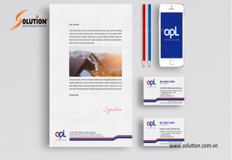
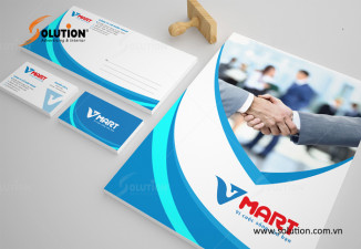
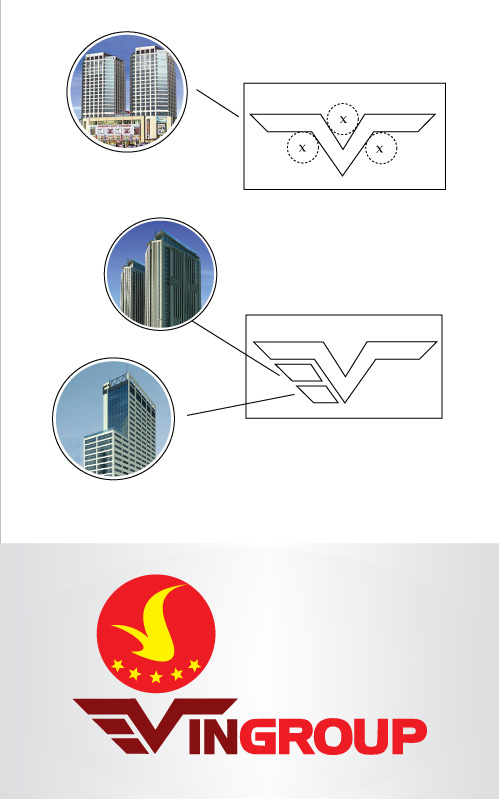
Solution of Vingroup logo design
Option 1: V stylized Vincom from the twin towers, two outstretched wings of the V created a solid foundation, lift bird logo is a symbol of general as well as group of companies members are the most famous brand in many areas.
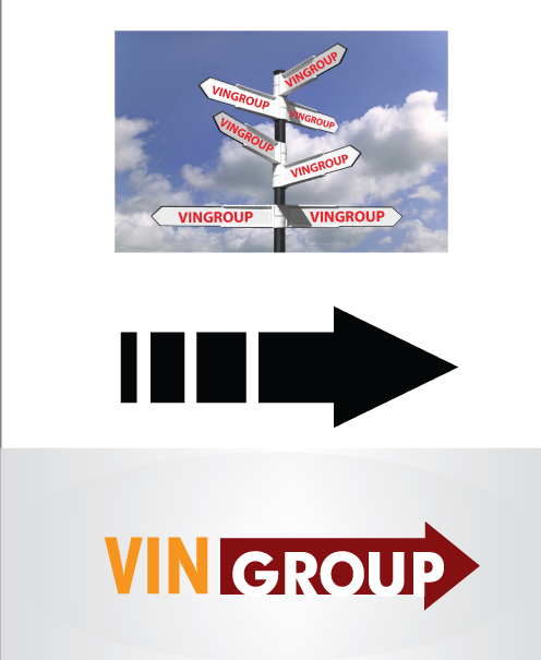
Option 2: An icon from here stylized arrows always point forward. As a pioneer, leading the way in just the way businesses send to customers.
The gap between image and text intentional feeling outreach growth and spread of symbols that are not restricted to large areas and across space. Immersed in a common but still assert itself.
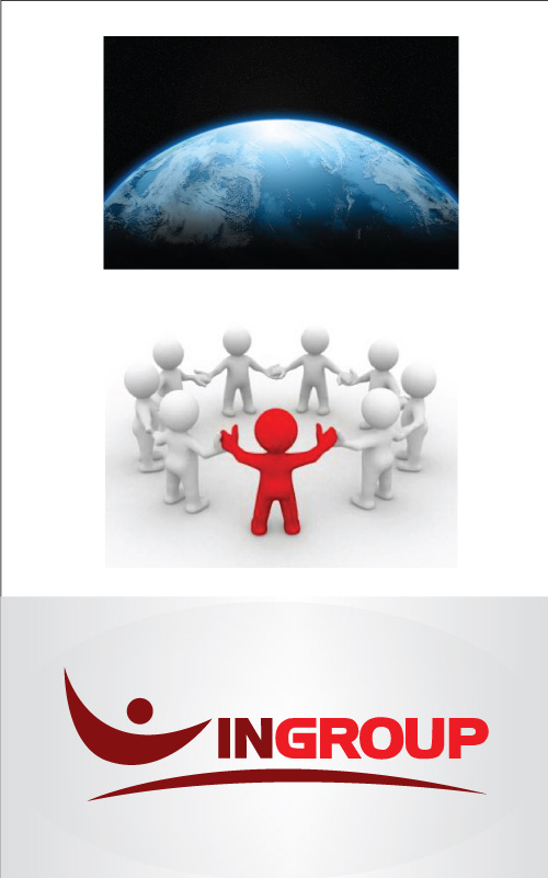
Option 3: From the sun symbol, earth, and man is the geographical advantage of natural elements of air.
Especially the human element in the dynamic posture, arms up as welcome, as friendly, feeling confident, inclusive.
VINGROUP brand has made ââtrade blankets, medium strong, firm.
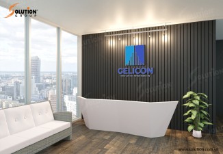
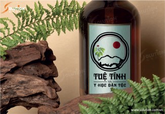
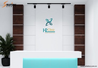
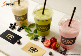
LiÊn háŧ Solution Group:
HÃĢy Äášŋn váŧi dáŧch váŧĨ thiášŋt kášŋ logo chuyÊn nghiáŧp cáŧ§a chÚng tÃīi Äáŧ ÄÆ°áŧĢc tÆ° vášĨn, thiášŋt kášŋ nháŧŊng mášŦu logo - báŧ nhášn diáŧn thÆ°ÆĄng hiáŧu Äášđp, Äáŧc ÄÃĄo, sÃĄng tᚥo và chuyÊn nghiáŧp nhášĨt:
CÃNG TY Cáŧ PHášĶN TᚎP ÄOÃN GIášĒI PHÃP VIáŧT NAM (SOLUTION GROUP)
Hotline: 0912525577 - 0976602468
Email: contact@solution.com.vn
Website: http://solution.com.vn/